

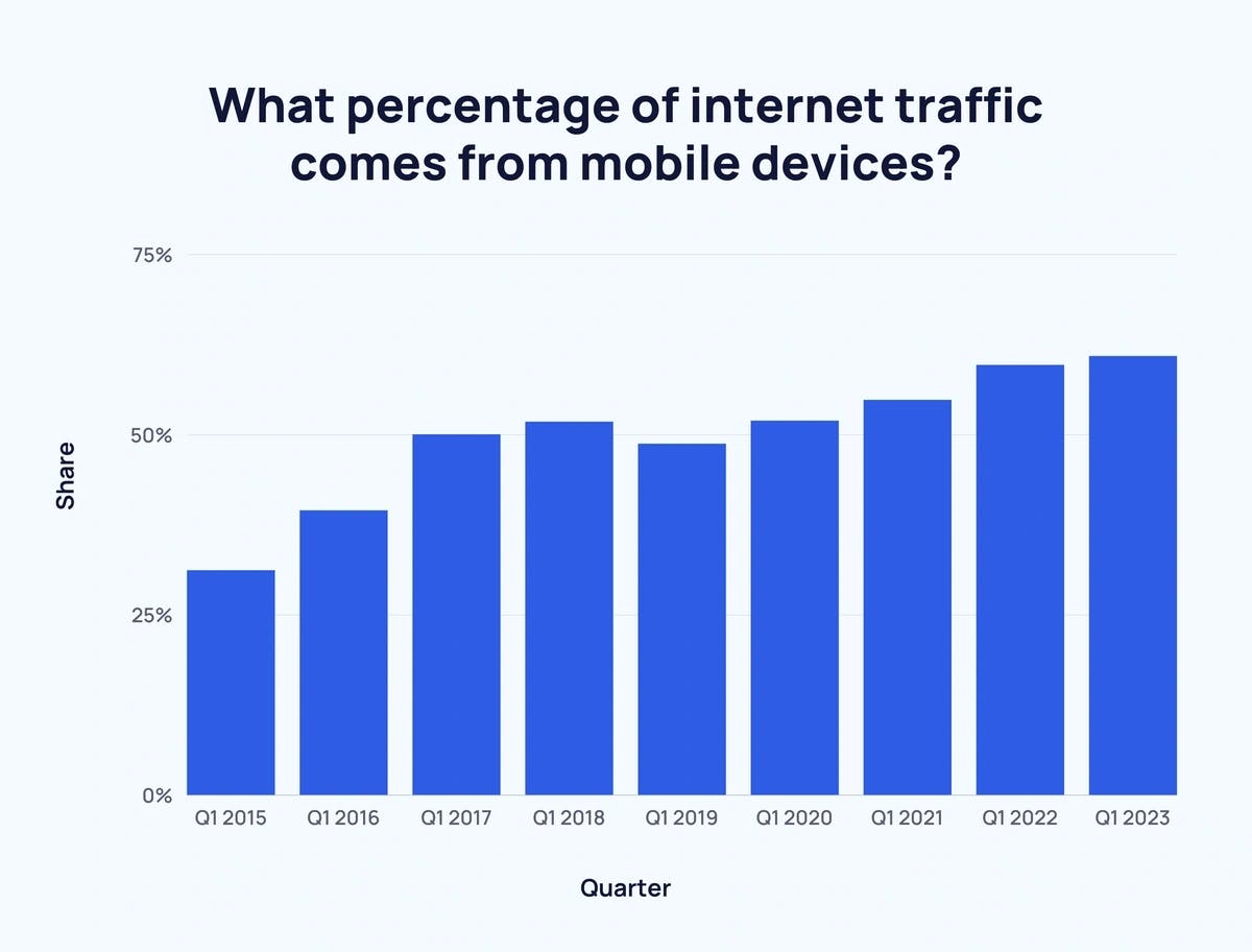
Recently, over 90% of Internet users use a mobile device. And over 65% of website traffic comes from mobile devices.
This increase in internet users with mobile devices calls for the need for responsive web design. Almost every website today has or requires a mobile version.
These, need for different versions of websites or web apps for different screen sizes won't reduce anytime, but rather increase as devices with diverse screen sizes will be made.
But now in the field of web development and design, we are getting to the point where creating a website for different screen resolutions would be inoperable. And the question is, what should be done?
What is Responsive Web Design?
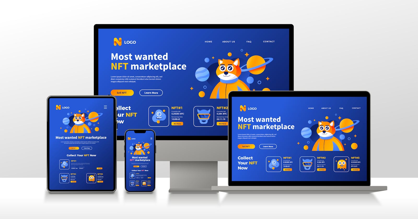
The concept of responsive web design is a design approach that ensures that a website's layout and contents are accommodated in different screen sizes of different devices. The aim is to create a website that has a seamless user experience on laptops, tablets, desktops, mobile phones, and other devices that access the internet, without the necessity of different designs and code basses for different resolutions. With responsive web design, the website's layout, content, and designs will adjust dynamically to the size of the screen being used.
Responsive web design can be fulfilled typically through the use of flexible grid layouts, media queries, and the use of popular CSS frameworks like Bootstrap, Tailwind CSS, and Materialize.
Flexible Grid Layouts
The use of a flexible grid layout helps the web designer or developer to create responsive websites that adapt and adjust to different screen sizes. And this is achieved by using the CSS grid layout which divides the website into rows and columns that can be rearranged, resized, and repositioned to fit every screen size. The flexible grid layout uses measurements that are relative such as percentage, and ems to make the design dynamic and fluid.
To use the grid layout, you first set the display of the container to the grid, if not CSS won't recognize styling.
body{
display: grid;
}
After that, you can now set the number of rows and columns wanted by using the “grid-template-column” and “grid-template-row”, like this
body {
grid-template-rows: auto 1fr auto auto auto;
}
body{
row-gap: 0.25rem;
column-gap: 0.4rem;
height: 100vh;
}
You can also set the height, row gap, and column gap as I have done above. There is more to grid layout than this, but won't go further in detail in this article. You can read more of it in MDN docs.
Media Queries
Media queries are used by web designers or developers to adjust the layout and styling of the website based on the screen resolution of the device. It allows for the styling of the website based on different resolutions.
A media query consists of the media type (the screen resolution type) and one or more expressions to check for specific conditions, such as viewpoint weight or height of the screen. For example, the following media queries are devices with a maximum weight of 720px and 1020px respectively :
@media (max-width: 768px){
     /*CSS rules for devices with a maximum width of 768 pixels*/
}

@media (max-width: 1200px){
/*CSS rules for devices with a maximum width of 1200 pixels*/
}
When the viewpoint width of the device being used is less than or equal to 768 pixels (this width is equivalent to that of a tablet and laptops with smaller screens). The CSS rules within the media query will be applied to the webpage. The same applies to the media query with a viewpoint width equal to 1200 pixels (desktop screens). With media queries, designers or developers can create different layouts and styles for different screen sizes, making sure that the website is dynamically accessible on a variety of devices.
Media is a great and powerful tool used by developers for creating responsive websites that look great on various devices.
Use of CSS Frameworks
The use of CSS frameworks can be very helpful when building a responsive website, as they come with pre-designed CSS rules and classes that can be used to style and layout a website quickly. These pre-designed CSS rules can be modified to give your website a unique look and feel.
When choosing a framework, make sure to look at its features and the features that you need on your website and choose the one that provides those features. For example, Bootstrap and Tailwind CSS are popularly known for their mobile-first responsiveness.
Furthermore, most of these frameworks come with a grid system, and this grid system works the same as the flexible grid layout. These two can use together to create responsive websites that look good on all devices.
In general, every website should be responsive, not just so it could be accessible on every device but also for the following reasons;
Improved SEO: For your website to rank high in search engine result pages, leading to higher traffic and more visibility. Google recommends responsive design as it makes it easier for their algorithms to index and organize content across devices. Responsive websites have better SEO and therefore ranked higher in search results.
Better User Experience: A responsive design ensures that users access and navigates websites easily, regardless of their device. This makes websites interesting to visit since users can use them seamlessly.
Cost and Time-Effective: Having a responsive website saves time and money, as you don't have to create and manage websites for different devices with different screen sizes. Maintenance costs won't be there also, as every content is updated and maintained in one place.
Should Every Developer Build a Responsive Website?
As there's an increase in the number of mobile device users accessing websites, there's also a high demand for websites that would be viewed in those screen resolutions.
As a web developer(especially a frontend developer) one of the things that should be in your mind while starting a project is the responsiveness of the website. A website that has a good user interface(UI) and offers a good user experience(UX) always attracts more users thereby generating high traffic.
When your website either personal or for a client have a great user experience, you get recommendations from both users and clients and this also makes you outstanding.
How to check for responsiveness as a Developer
There are several ways a developer can check the responsiveness of a website or an application. This is necessary as it helps you determine the responsiveness of the project before publishing. Some of the ways are listed below;
Use of Browser DevTools: This is one of the most popular browser tools used by developers. This tool is available in most browsers such as Chrome, Firefox, and Microsoft Edge. This tool can be accessed by simply right-clicking on the page and selecting inspect, or by pressing the keys "CTRL" + "SHIFT" + "I" to open the developer's tool, then "CTRL" + "SHIFT" + "J" to open the responsive window. These commands are for windows, on Mac you replace the "CTRL" with "Cmd". The responsive window is adjustable to different screen resolutions., letting you know how your projects look on them.
Automated Testing: You can use automated testing tools like Selenium or Cypress to automatically check for the responsiveness of your application or websites.
User Testing: This involves letting real-time users use the application or website on different devices and get their responses on the behavior. This could be useful as you will also get feedback on not just the responsiveness but also on the general user interface and experience of the application or website before you publish.
In conclusion, the responsiveness of an application or website should be among the priorities while working on them. A website that is not responsive is not projecting a good User Interface(UI) and User Experience(UX), and a developer who can't provide both isn't just enough lol. And for businesses and companies, if there's no responsiveness in your website or application you'll lose customers and that would probably affect your firm.